Somewhere Over the Rainbow – The Psychology of Colour in Interior Decorating
The use of colour in décor is a personal choice, but certain considerations are important to take into account when selecting the perfect shade for your room or furnishings. This month we’ll be exploring the psychology of colour and how we can use it to our advantage in the home and corporate environment.
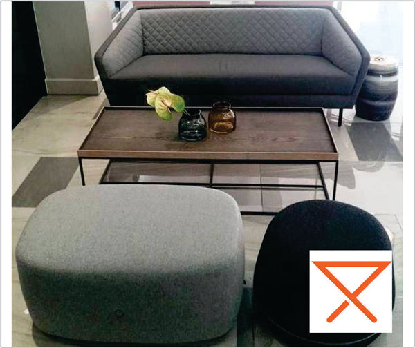
Whether you are a home decorator or an interior industry professional, there is one rule that is constant; What may look fantastic in a photo-shoot or showroom display may not be comfortable to live with or work in. The psychology of colour examines how colours affect people directly and within their environment. There are certain preconceptions about what colour works where and with what, but remember, people react to colours differently. For example, some may find red energetic and passionate while others find it dangerous and disturbing.

A rich, but slightly muted blue scheme brings sophistication and relaxation with a contemporary flair. Image: www.decorilla.com
The accepted rule of thumb states that people find the blue-green spectrum relaxing, the red-yellow range energetic, while neutrals (grey, beige, white) bring serenity to the surroundings. This becomes a little more complex when the hue or tone of each colour is taken into account.
The level of energy or degree of calm in a room can be fine-tuned by using different shades of a colour. Take red for example. In the home, crimson and vermillion shades of red may be great for a pop of colour on a feature area or in a throw of scatter cushion, but complete overkill when used walls or ceilings. It depends on the room and the desired effect. Alternatively, a soft rose red may be the ideal shade for you dream boudoir, but will look overbearing and drab unless used in conjunction with complimentary highlights and clever accessorising.
In this trip through the colour spectrum (and a little beyond) we’ll consider some options for use and examine what message we may be sending.

The clever use of reds brings warmth and focus to this stunning open-plan apartment Image: www.dmarge.com
On researching this month’s blog I noticed that most articles about colour begin with red, and this one is no different. Does red represent Love? Excitement? Danger? As everyone responds differently to colour, there is no one answer. Deep hues like maroons, plum and wine won’t be out of place in an established law office or parliamentary chambers, but could be oppressive and far too formal in the home. Rose red, deep crimson, ruby and claret shades are used regularly in the romantic bedrooms, and although implies heightened passions might not be the best choice for a relaxing night’s sleep.
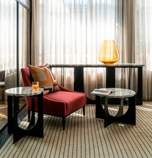
Our advice is to use red judiciously as it is medically proven to raise blood pressure, boost the metabolism and increase respiration – important considerations for your family. Red is used effectively in the corporate sector as the colour implies leadership and willpower, while increasing energy levels and comraderie. Remember though, the overuse of red in the workplace could easily have the opposite effect and spark anger outbursts and raised emotions. Use neutral shades like soft grey, stone or parchment to tone things down and maybe even the judicial use of a dramatic black feature furniture, or smaller wall to throw the red into focus.
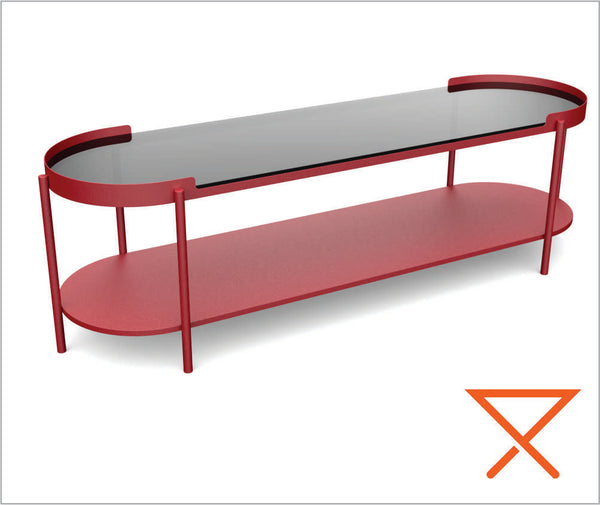
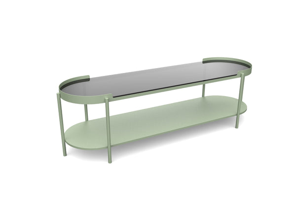
Leonardo Design has included a beautiful Ruby option amongst the 12 colours in our range. Seen below is the Lafayette Wood Topped Console. This stunning piece will not be out of place in the home or corporate/hospitality sector and can bring just the right amount of red to your décor scheme.

The Lafayette range has a retro feel and sophistication and wears it’s vibrant coating perfectly. The full collection includes a console and matching coffee table, round coffee table and a handy up & over styled side table. All are available with wood veneer and toughened smokey-grey toughened glass surface options
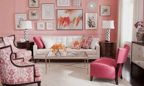
Taking red down quite a few tones, Pink can be used effectively either as a calming, loving colour, or a bold statement. The range of pinks is overwhelming; from the softest pastels that can easily take the place of white when wanting a slightly warmer, yet neutral backdrop to your room, to the dominant theme of a room or venue.

The Pink Salon at The G Hotel in Galway, Ireland Image: Stylist Marie McMillen. Photographer Ashley Morrison
Although it will always be a favourite for girl’s bedrooms, Pink has broken free from the world of unicorns and slumber parties and taken its rightful place in mainstream décor, with simple patterns and sophisticated designs bringing life to both the contemporary and traditional home.
Try pairing vibrant fuscias and magentas with pale blues or greens and whites in cushions or prints for a holiday vibe, or throws in shell pink and yellows for a fresh feel. Because it influences the emotions, when used correctly, pink and all its shades create an atmosphere of love and compassion.
A coral wall is cleverly played down by the white in the artworks and neutral colours of the accessories of this sophisticated scheme. Image: www.decoist.com
I remember a time in the 70s when one of the trending colours was Roman Copper, a rather flat and gloomy shade of brown which adorned many décor schemes of the era. Thankfully those days are long gone, and although brown waned in popularity for some time, it has come back in recent years with a wide range of neutral and strong variants and has been welcomed with open arms by savvy decorators.
As a neutral, brown is a relaxing, confident colour and as such should be used carefully. While making one feel comfortable, it should still be visually interesting. Too much of one shade will look drab, so your complimentary colours should be well considered to the overall scheme, and the people who will using the room.

This considered room is the perfect use of the brown spectrum working in harmony with soft colours and textures in the accessories. Image: www.bocadolobo.com
The brown palette is easy to layer with other naturals like stone and cream, and is also the perfect base for combining with bright colour feature walls, furnishings and accessories. It is a reassuring colour and is ideal for use in large areas like double volume buildings, where it can bring warmth (as it is a relation to the red family)and delineate areas while complimenting so many other colours.

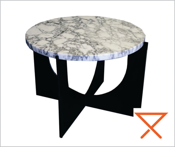
Leonardo Design recently introduced Brown Olive to out colour range. Here it is seen in the Silhouette Side Table
As the Leonardo Design brand colour, Orange is naturally a favourite of ours. Vibrant orange was another of the 70s popular colours and it suddenly appeared on everything from cars and interior paints to lampshades and fluffy toys. Orange has always been a warm and happy colour and although it is an easy colour to overdo, with clever use can elevate a room from impressive to show-stopping.

The dramatic use of charcoal walls with vibrant orange rug and furnishings makes a huge visual impact - Image: mydecorative.com
The orange palette ranges from rich coppers to pale pastels. Although the perfect foil for dark dramatic backdrops it also compliments the full green spectrum and is therefore perfect for both opulent, bold designs or bright, fresh prints.
Our Leonardo Orange is the perfect shade to bring a happy pop of colour from children’s playrooms to funky company reception areas.

A collection of fun side tables from Leonardo Design crafted from mild steel with a Ferrugrain powder-coat finish for protection and easy maintenance. Left to Right: The Tubular Side Table, The Olive Side Table, The Silhouette Side Table, The Hilton Side Table, The Cone Side Table.
Another of the bright, happy colours is Yellow. From pale tints to deep hues, yellows will always bring a feeling of warmth and brightness to a setting. Whether you decide to use it as a main or accent colour, it has the effect of uplifting the spirits. However, those who suffer from (or have family members who are prone to) hyperactivity, the overuse of yellow in a room can raise the blood pressure and may not be the ideal choice.
Yellow is the ideal pairing colour and is the perfect compliment to greens and blues. It also enlivens pinks, purples and most reds. The 90s saw the pairing of grey and yellow becoming popular and this combo is still often seen and brings a level of sophistication when used correctly.

A bold use of yellow in this cheerful living room. The use of neutrals in the furnishings and accessories tones down the palette perfectly. Image: www.lushome.com
Of the fresh colour palettes green is a favourite. With associations of peace and calm, it is a favourite of decorators – and here are so many options to choose from! Light green tones and turquoise hues have a calming effect, warm greens feel safe and comforting, olive shades are peaceful and harmonious while bright lime shades are perfect for bold colour pops. So may options – so few walls!
Green hasn’t always had a happy history and, until relatively recently, nearly every institutional building used a particular dull shade of green. The thinking may have been sound as most greens are calming, but the colour chosen was a depressing pea soup shade, normally combined with a dull cream. Fortunately, those days have passed and although you still see that traditional old combo on occasion, most building now thankfully opt for bright, fresher shades when using green.

Leonardo Design has two greens in their colour range. A muted deep sage and a rich green olive. Seen below is our Lafayette Wood topped coffee table in Green Olive which was used on the Blaque Pearl stand at the Joburg Design Expo earlier this year along with our Tubular Side Table
Greens are also easy to combine. Green feature walls compliment the shades houseplants beautifully. You could also use a paler shade as a wall colour and bring it to life with darker tones of green in the furnishings and accessories. However you use it, you are in safe hands with green.
Blue is another decorator favourite for good reason. Blues are relaxing, can be dominant and dramatic, or be the perfect pale, relaxing backdrop to your room – it depends on the shade, combinations and, of course, your personal preference.

Psychologically, blue slows the heart rate and therefore has a calming effect. Blue is one of the few colours you could use in different shades throughout your house without it becoming overbearing, obtrusive, or boring. Turquoise and Aqua shades will always be reminiscent of the ocean, and combined with crisp white and darker blues, have always been a popular choice for holiday homes.
The use of a deep, dark blue in a small room may not seem like everyone’s choice but with addition of warm colours, strategic lighting and a few striking contrasts, could be the ideal solution to a tiny area. In all its shades, blue is a relatively safe choice when decorating.

Leonardo Design’s chosen shade of blue is Skylark. Bright and vivid and perfect for playrooms or to bring a surprising colour burst to any scheme – seen here in our Corin Side Table
Purple is an interesting colour to use in the home and is well known to inspire creativity. As such this is the perfect palette for a studio or kitchen. It is also perfect for adding a splash of opulence to a bathroom sanctuary or dressing room. Like the blue spectrum, purple works perfectly with most colours and can be toned up and down to suit the desired effect.

Once reserved for royalty, purple is now in the domain of all and is found in everything from Bohemian themed rooms to high-style décor – Image: www. sebringdesignbuild.com
Black is often thought of as a no-no in the home but used properly it can avoid the pitfalls of being gloomy and overbearing. As it can be paired with literally any other colour, its uses are varied and an extremely handy tool in the decorators’ arsenal to help make a statement in any room.
Grey is another of those colours which was once associated with prisons, institutions, run-down buildings and gloom in general. Attitudes have changed drastically and soft greys have been embraced and widely used for years for both interior and exterior use. It is an easy neutral to dramatize, brighten, tone down, used for a feature wall. However, you want to use it, grey is the perfect foil.

A sophisticated use of black and grey in this decidedly masculine room – Image: www.home-designing.com
In any colour spectrum everything stems from white. As decorators know, the range of whites on the market can be as varied as any other colour. Warm white, cool white, whites with the palest of tints and various textures and sheens. It is the decorator’s blank canvas and as it implies cleanliness and purity, is a widely used choice in modern architecture, health spas and minimalist homes. Whites create the illusion of space (great for claustrophobics) so is a regular choice for modern urban living where rooms can be small and floorspace is often limited.

Whites and neutrals used in perfect, relaxing harmony. The layers of texture in the accessories and furnishings bring sufficient interest to the setting while adding warmth – Image: www.mydomaine.com
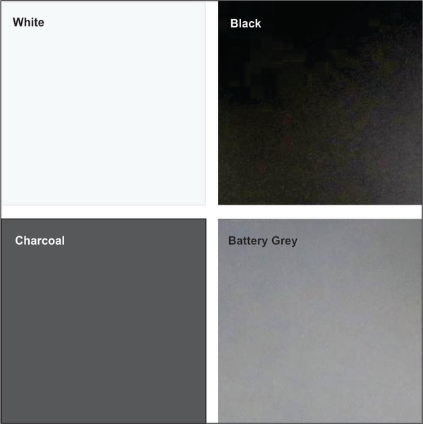
As the most commonly ordered colours, the Leonardo Design’s colour range naturally includes two whites, a black and two greys; a warm charcoal and a cool Battery Grey. Below is our full colour range

As you can see, the psychology of colour is a wide-ranging topic and adds another dimension to the list of considerations when planning a décor scheme for yourself or a client. What may be the perfect combinations for some could make another person feel uneasy. This isn’t necessarily because it is jarring, but could be a psychological reaction to certain colours.
As it is such a fascinating subject, and we may revisit the detailed use of colour in future editions of our monthly design blog. For those of you who have been hesitant to play with colour, we hope that we’ve given you some inspiration. For those who are comfortable with colour – shine on!
Wishing you a stylish and colourful month – Frank