Creating Design Harmony in the Home
As this is our last design blog of the year, and with wellbeing as one of the key interior design trends for 2023, we close the year by looking at creating design harmony in any space.
Sometimes one walks into a room and, no matter the style, immediately feels relaxed and drawn to spend time enjoying a space where every element works toward creating a nurturing, calming whole.
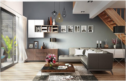
Image: Homeimprovementanddecor.com
Everyone has their own ideas of harmony. Some may feel comfortable in a minimal, monochromatic space, while others need a healthy dose of visual interest. Either way, with some judicious editing and a little thought, you can have fun achieving the desired result.
Visual weight may seem like an odd term, but simply means having a balanced room without too many heavy or bulky pieces of furniture in one particular area or side of it. Rearranging (and maybe some shedding of) the furnishings so that they create a more balanced look will immediately make a room feel calmer and visually pleasing.
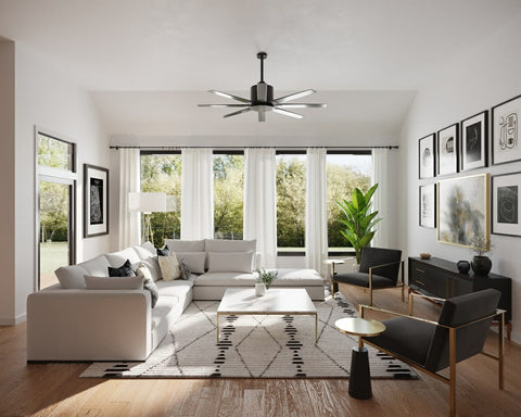
Image: Decorilla,com
A simple way to create a harmonious look is with symmetry. Having pairs or multiples of an item like couches and side tables set facing each other can’t help bring a sense of balance, but be careful that it doesn’t look too rigid. Matching everything is not the intention, and a way to avoid this is by placing different objects of a similar size and dimension on opposite sides of the room.

A perfect symmetry of chairs in this elegant room from clients, Living Divani. Coffee tables from Leonardo – Tables by Design. Image: Living Divani
Aim for cohesion with the placement of furnishings. Pieces that serve no apparent reason can be confusing to the eye (unless purposefully used to accentuate an area like an unused corner or section of wall). Linking different seating/dining/working areas with rugs or runners helps this cohesion and will prevent any area feeling it isn’t a considered part of the overall design.
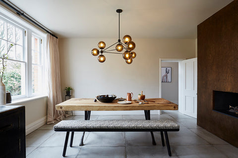
Using negative space to bring focus to the room's décor elements. Image: Houzz.co.nz
Using negative space in interior decorating is an effective way of helping edit a room. The ‘non-decorated’ space gives the eye a place to rest before travelling to the next point of interest and helps bring your décor into focus. This being said, the negative space should look intentional and not as if you just forgot to decorate it. The goal is to achieve the perfect amount of furniture, art and accessories so that it feels full but not cluttered, sophisticated and exciting.
Choosing the correct wall décor is a key part of any space but isn’t as difficult as some make it out to be. The first and most important rule is not to clutter. You may have an extensive art collection but it doesn’t all have to be hung at the same time, and especially not in the same room!
When hanging artworks, the eye should travel around the room comfortably without any art pieces vying for attention. When grouping a collage of smaller pictures, make sure the spaces between them are equal and/or look pleasing. Although a general rule of thumb is to have the top or bottom of the frames at the same height, this can also look forced. By keeping the artworks at the approximately the same level helps the eye travel easily around the room.
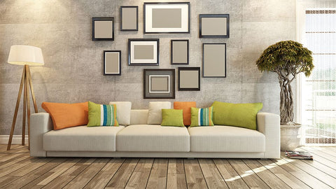
Image: Furnishingtips.com
Using a collage of paintings to lead the eye up to a décor feature at a higher level in the room, like an interesting architrave or a mezzanine level, can be very effective. We tend to decorate at or below eye level and forget an areas full volume. Try adding some design interest on the tops of fitted bookcases or cabinetry, or even paint the ceiling and some feature walls in a complimentary contrasting colour to add visual interest and help carry your theme throughout your area.
Using the negative space technique, hanging an artwork in the turn of a hallway so that just a part of it can be seen is a clever way of creating a visual tension that entices the viewer to explore further.
When hanging a feature mirror, place it where it will reflect the maximum amount of light into the area but, if possible, not in your direct field of vision as this can be distracting.
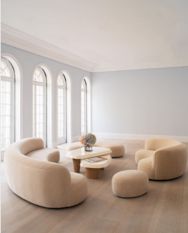
Image: These undressed feature windows become the main point of focus in this interesting area from the Sotekonia.com site.
Sometimes the architectural features of a room, like a narrow wall or small alcove, look far better when left unadorned. If you are lucky enough to have an interesting architectural feature in your space, not decorating it can help make it a feature in itself.
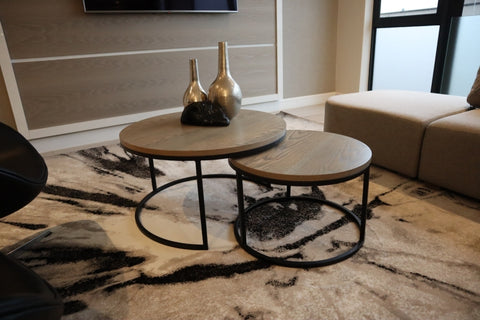
An interesting grouping if ornaments shown perfectly on the Swift Coffee Table Nest from Leonardo - Tables by Design. Image: Pellarade Houghton Suites
Ornaments have a tendency to multiply over time and the temptation is to cover every available surface with groupings and table-scapes. Unfortunately, this often means that the pleasing lines of tables and shelves are often masked.

Image: The Nightingale Side Table Nest from Leonardo - Tables by Design, simply dressed to suit the décor
An easy way around this is by limiting the number of groupings and to change the objects with each season or as whim dictates. This will help the overcrowding problem and stop your cherished ornaments becoming ‘stale’, while giving the room a new energy.
Living with negative space is a concept that may feel strange to some, but my advice is to live with it for a few days. If you still feel uncomfortable, fill the space again.
Whether you are tackling one room or a whole house, starting with a clear design concept helps you focus on selecting the right pieces for each area. List what you want to achieve and identify existing pieces you would like to use. Using common characteristics through any space helps the eye travel easily without jumping from spot to spot. Design elements that have a shared connection will naturally look more harmonious than a jumble of jarring objects that have no relation to each other.
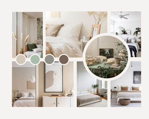
Image: Pinterest
Create mood boards with magazine cut-outs, fabric samples, notes and sketches. A mood board is tangible and, despite technology, is still preferred by decorators.
Whether your preferred style is easily recognisable or your own wonderful mismatched combination of pieces, the same core principle of leading the eye on a harmonious journey around the home applies.
Sound advice from Apartmenttherapy.com is to ‘start with an eye-catching element nearest to you in the room, and then identify secondary focal points that are located around the space, like an art piece or a favorite chair or a pillow with a pattern you love.
Then, use common design elements like color, shape, pattern or repetition to let your eye “hop” from element to element, as your eyes make visual connections between décor items, sweeping smoothly through the entire space. So a bold patterned blanket might catch your eye, and then a color from the blanket might show up in a stack of books on the coffee table, which might connect with a piece of art a little bit farther in the room, that might mimic a shape of a furniture piece all the way in the back’.
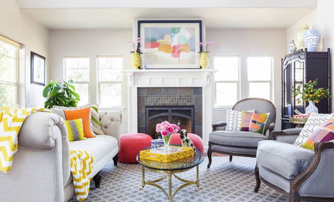
Image: Medium.com
Remember, harmonious spaces are ones where everything feels connected and cohesive.
As we mentioned in the beginning of this article, harmony means different things to different people, but whatever your personal definition may be, we hope that you have enjoyed this month’s harmonious look at style.
This will be our last blog of the year but will be back in January with more insights into the world of interior décor.
Yours in Style – Frank


